





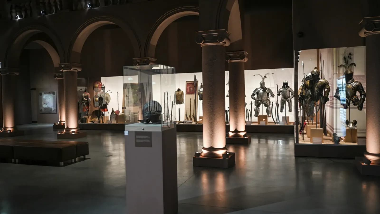
Designing a museum app
Dozens of UI directions. One clickable prototype.
49
home variations
30+
screens designed
5
narration modes
days
not weeks
What we set out to build
We turned the brief into a runnable product in a single design system — so the client could click through Museo, compare directions and decide fast, long before development started.
A reusable showcase framework
One AI-driven system rendered the app inside a realistic iPhone mockup, a living brand book and a grid of variations — so every new idea slotted straight in.
49 home directions, fast
Instead of one safe homepage, we generated 49 home-screen variations and pressure-tested layouts, hierarchy and emotion before committing.
The full flow, clickable
Scan → recognize → narration, onboarding, artwork detail, profile, premium — a real interactive prototype, not disconnected static frames.
A living brand book
The Dark-Luxury design system (obsidian + copper) was documented as living UI — colours, type, buttons and inputs stayed consistent across every screen.
Decisions in hours
Stakeholders compared real directions side by side and approved a path in hours, turning weeks of mockup rounds into a single sitting.
Straight into development
The validated prototype became the spec for the production Flutter app — design and engineering never drifted apart.
Home screen — 49 AI variations
These are the real, interactive prototype screens — not mockups. Scroll the panel to explore the directions we generated with AI.
14 of 49 home variations — live & interactive · 1/3
The scan interface
From raising the camera to hearing the narration — the core loop, prototyped end to end. Real, interactive screens below.
16 scan-flow variations — live & interactive · 1/4
The audio player
Animated narration screens with rich, artwork-driven backgrounds — the moment the story actually plays.
15 audio-player variations — live & interactive · 1/3
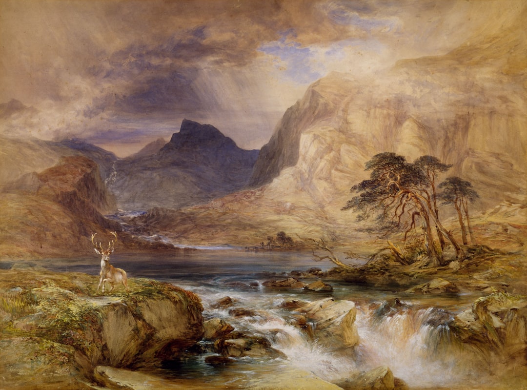
The Night Watch
...into the shadows of the background.
Notice how the light falls not from a single source, but seems to emanate from the figures themselves.
This technique, known as chiaroscuro, was mastered by Rembrandt...
Expert Commentary
Rembrandt's Light
The Night Watch
Tap anywhere to hide controls
The Night Watch
Premium & paywall
The upgrade moment — pricing, benefits and the subscription paywall, prototyped in full.
15 premium / paywall variations — live & interactive · 1/3
Join the Patrons
Unlock the full Museo experience
ALEX MILLER
ID: 884-291-PATRON
Recurring billing. Cancel anytime.
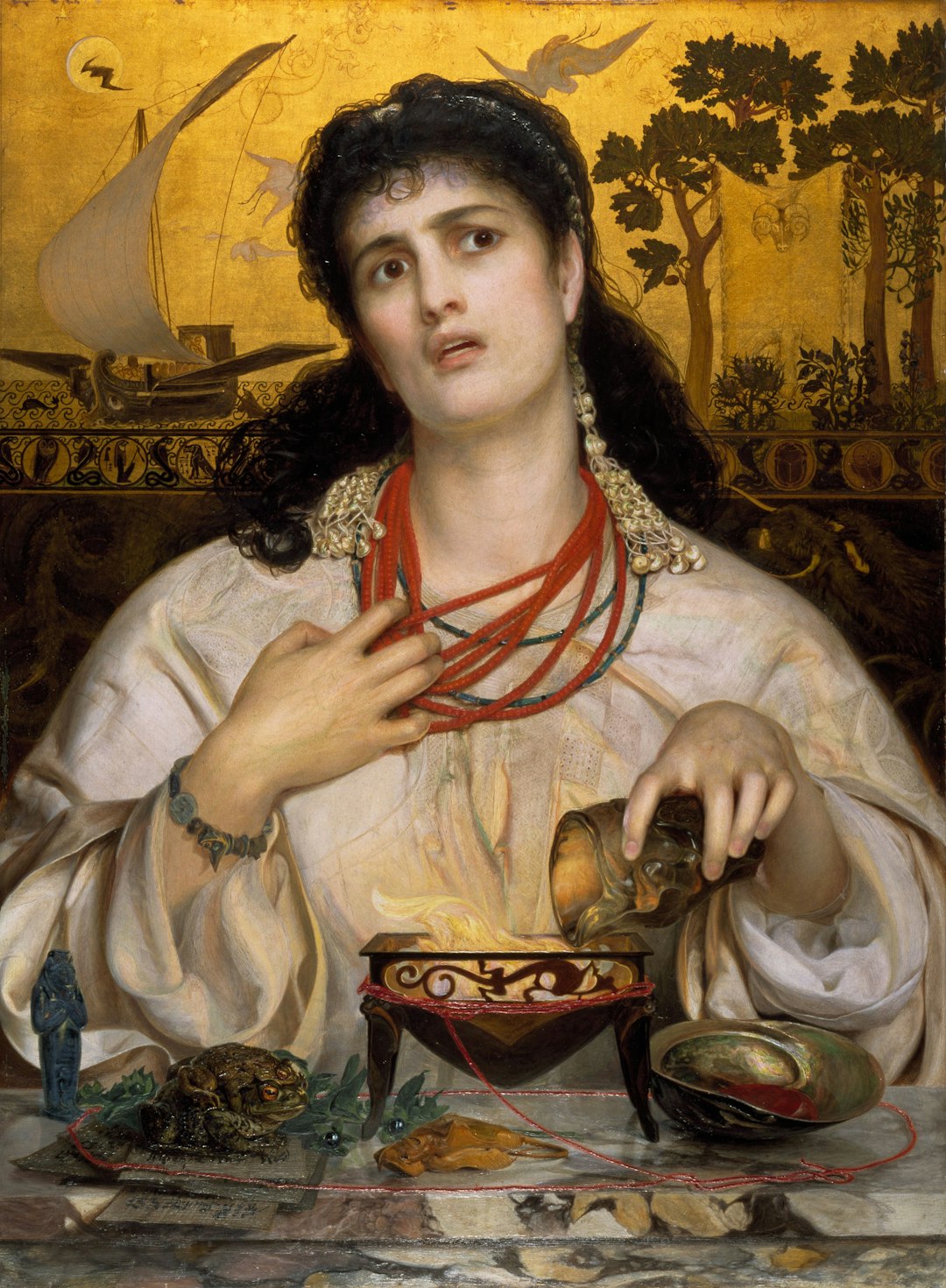
LIMITED
See What You're Missing
Unlock The Hidden Layer
HD Zoom
Expert Audio
Manifesto
Art is not just
to be seen.
It is to be
understood.
Museo Premium isn't just a set of features. It is a commitment to the preservation of stories that define our humanity.
Become a Patron today and ensure that no masterpiece goes unheard.
Upgrade Plan
Unlimited
Visual Recognition
Identify unlimited artworks instantly.
Audio Guides
Curator narrations
Offline
Save for later
Support the Arts
Your sub funds museum digitization
Unlock Infinity
Experience art without boundaries. Deep zoom, expert narratives, and exclusive access.
The rest of the app
Onboarding, login, artwork detail, profile and more — the whole experience designed as one system.
9 of 30+ screens — live & interactive · 1/2
Hear the story.

Every artwork has a story waiting to be heard.
Profile
Art Lover
Member since Nov 2025
24
Favourites
156
Scanned
Quick Actions
Brand Ambassador
Brand Ambassador Mode
Help museums by documenting artworks
Narration Style
Select how you'd like to experience art
Special Modes
Favourites
Living brand book
Dark Luxury, by design
Obsidian
#1a1a1a
Background
Surface
#121212
Cards
Border
#2A2A2A
Dividers
Copper / Champagne
#eac0a2
Accent · CTA
Copper Dark
#b89780
Hover · gradient
Slate
#8E8E93
Secondary text
Display · serif
Museo
Body · sans
A premium, calm, sophisticated voice — Playfair Display for headlines, Inter for the interface.
5 narration modes
Classic and Express are free; Expert, WCAG and Children's are premium — each a different way to hear the same artwork.
And the logo
We designed the Museo wordmark and mark to sit in that copper-on-obsidian world.



Beyond the app
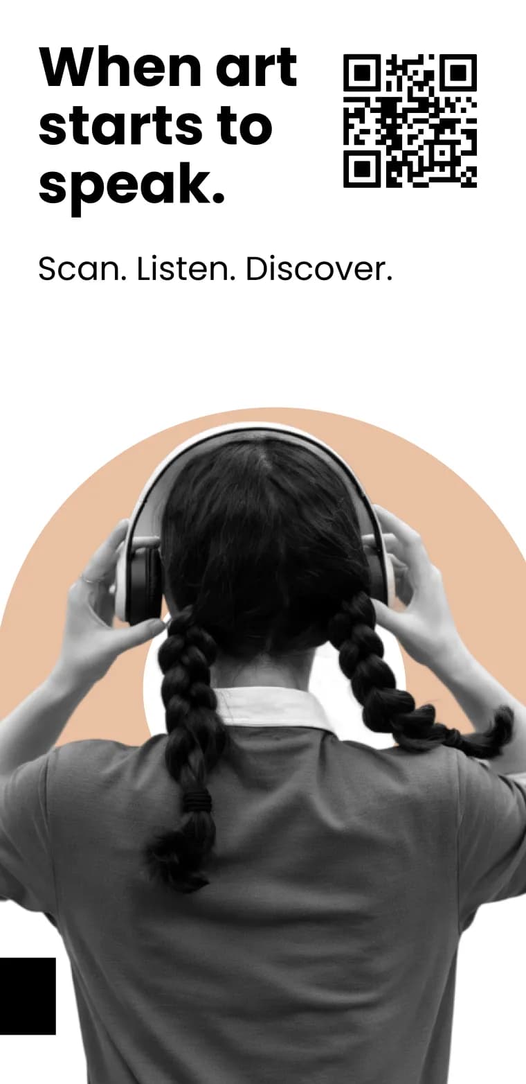
We designed the print materials too
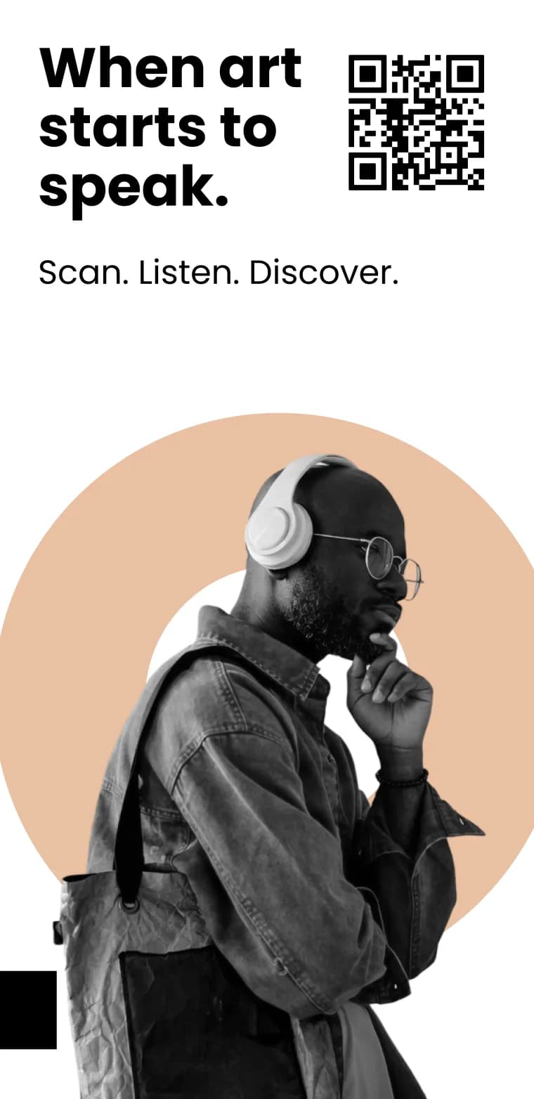
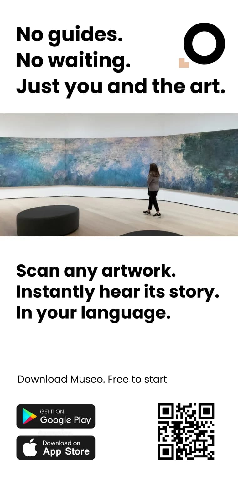
Posters and flyers in the same Dark-Luxury language — a QR straight to the app and one promise: Scan. Listen. Discover.
Museum app design — FAQ
What makes a good museum guide app design?
A good museum app design gets out of the way: one obvious action — scan an artwork — a calm, premium look, and full accessibility. For Museo we used a Dark-Luxury design system (deep obsidian with warm copper accents), so the artwork stays the hero while the UI feels like the museum itself.
How do you design a museum app that is accessible?
Every screen in the Museo museum guide app is designed to WCAG 2.1 AA — large tap targets, strong contrast, screen-reader labels and a kids-friendly mode — so visitors of any age or ability can use it.
How long does it take to design a museum app?
With AI-assisted prototyping we explored dozens of UI directions and a full clickable prototype in days, not weeks, then handed a validated museum app design straight to development.
What design style works best for a museum app?
Museums are premium, calm spaces, so a dark, elegant style with a single warm accent reads better than bright, busy UI. Museo's Dark-Luxury palette — obsidian and copper — was chosen to match that gallery atmosphere.
From idea to clickable prototype — fast.
Then we built it for real. See the Museo development case →
Get the Museo app


Let's make something together.
At Codigee, we value transparency, efficiency, and simplicity. No overengineering. No wasted time.
Just straight-up execution.
We are obsessed.
Every billion-dollar company started with one decision, one step, one iteration. The key? Taking action and executing fast.